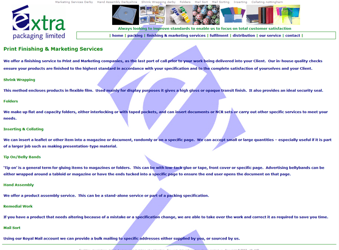
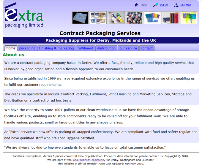
This project was focused on client-side web development, involving HTML, CSS and JavaScript. It involved re-designing a local packaging company’s website and writing a report, detailing how the re-design improved upon the original.
The report focused on the following aspects:
- How well the site adheres to current web standards
- Cross-browser compatibility
- Accessibility & usability
- Search engine optimisation
- Site content in relation to the target audience
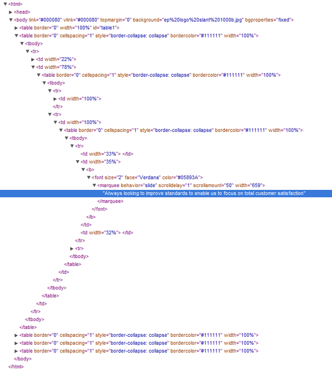
One of the major problems with the site was a lack of separation between content and style. The entire structure was created using a HTML table, which it isn’t designed for. The CSS was practically non-existent as all of the styling was done inside the HTML. This led to a horrible tangle of HTML code that would be extremely difficult to maintain.

This also had a knock-on effect accessibility. By improving the structure of the site and separating content, style and interactivity correctly between HTML, CSS and JavaScript, the accessibility of the site improved as screen readers were able to scan the pages and users could modify certain aspects such as font size without the layout breaking.

This project really opened my eyes to the importance of a well written website. By writing clear, validated mark-up and separating the styling, many benefits can be achieved, such as cross-browser compatibility, better search ranking, easier maintenance and improved accessibility. This was a thoroughly enjoyable project, I particularly enjoyed the feeling of ‘crafting’ a web page through well written HTML and CSS as up until this point I had only used WYSIWYG editors such as Dreamweaver with little appreciation of the code that it created.
