This was a project that came about quite fortuitously. I had just finished reading the excellent Mythos by Stephen Fry in which he regales the Greek myths with much wit and wisdom, it is a highly recommended read. Throughout the book I thought that some sort of family tree would be beneficial so as not to lose the thread of the story. There are family trees in the book, but these are just for the most important characters and only show two or three generations.
The next moment of luck was when I discovered the stunning Royal Constellations visualisation by Nadieh Bremer. This is a quite brilliant visualisation of the royal families stretching over the last one thousand years. She is a genius in the field and I highly recommend you check out her work.
Standing on these shoulders of giants so to speak I set out to combine the two…
Data Gathering
The first task was to re-read the book and generate some sort of dataset to convey the people and how they are connected. This took the form of a simple Excel file where I could record details of the people, give them a unique ID number and in a separate column, record which IDs they were connected to. This file morphed a lot throughout the reading of the book. I started with just direct parent/child relationships but then I noticed that the number of connections would be quite small, and a lot of the juicy detail in the Greek myths is across the family boundary. I decided to record spouses and acquaintances (friend or enemy) as well.
Visualisation
D3.js was used to visualise the graph. Although I’m a D3 novice, I believe D3’s paradigm of connecting data to SVG elements (which most web developers and designers are familiar with) make this the most powerful visualisation option available. The fact it also works on the web makes it even more attractive.
D3.js provides a force layout visualisation which is a nice way of visualising graphs like this. Force layout is a physics-based visualisation that uses forces to position nodes. It requires a nodes and links file to work. The nodes file contains the people along with their attributes like name, gender, home, age etc. and the links file contains the details of the edges between the nodes. This file requires a source and target id so it knows who to connect up.
Data Munging
The original Excel dataset therefore had to be converted into this format. I created a Python script to read the data and create JSON files for the nodes and links.
Design
Armed with the files I set out to visualise the graph. At first, I struggled to get anything to display. D3.js has undergone a major upgrade recently (v5) which has introduced some breaking changes and the documentation is yet to catch up unfortunately. The reason I couldn’t see anything was that v5 now uses JavaScript promises to perform blocking tasks. I modified the JSON import call to use promises and behold!
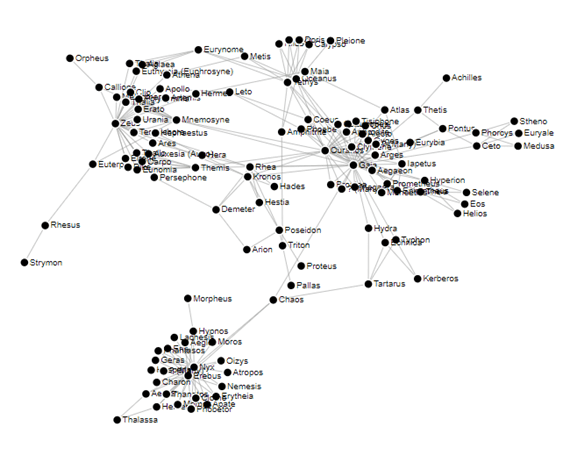
There was much rejoicing. I completed the book in haste and finished adding all of the connections. I added a splash of colour (coloured by category e.g. Titan, Olympian, Sea God, Monster, Nymph etc.) and voila:
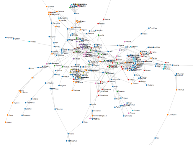
I noticed some nodes were left disconnected from the graph. I tried to read up through their histories to try and find an ancestor to link them to. The superb site Theoi.com is an excellent reference tool for anyone who wants to find out more about the Greek gods. For those I couldn’t find, many myths end with prayers or sacrifices to gods, so Zeus was chosen as a link for those.
Structure
My happiness soon waned however. There wasn’t any structure to the graph. You can see clusters around the main characters like Zeus in the centre and Gaia and Ouranos on the right but would anyone be able to ascertain anything more useful? Probably not.
So next, I tried to highlight the major characters by increasing their node size. I removed the titles to tidy it up and changed the edges to curved lines to see if a clearer graph helped:
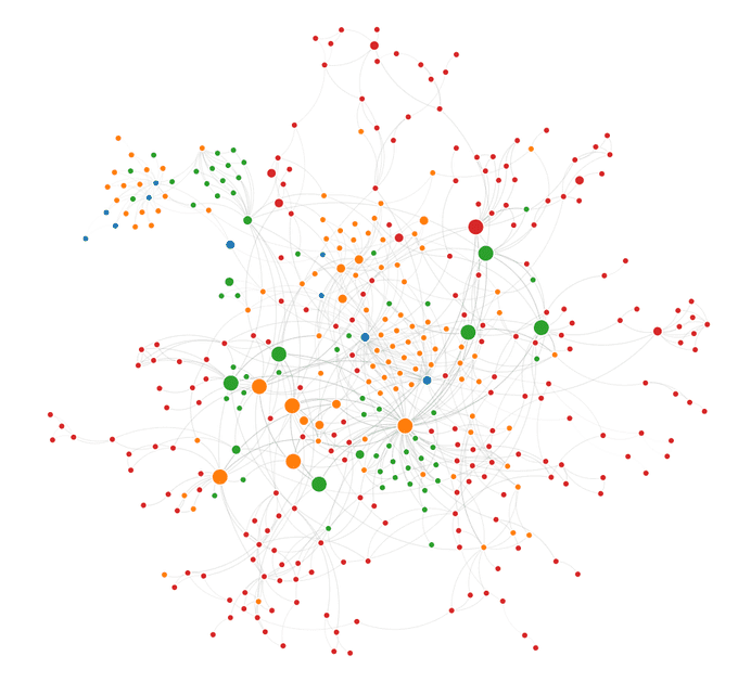
This looked tidier but it was in essence just a hairball graph, there was no immediate information that could be gleaned from looking at it. There needed to be a way of separating the nodes based on something interesting in the data. The larger nodes are the twelve Olympian gods. These are the main deities of Greek mythology and considering that most connections involve these, it made sense to try and space them out evenly to draw out the edges and limit the number of crossings.
In the same way Nadieh separated the royal families, I calculated a person’s closest Olympian from which I could arrange them evenly along
the x-axis using the forceX() method. This kind of worked, it was no longer a hairball, some semblance of structure was emerging.

What about the y axis? I tried to arrange them by their home. Greek myths are replete with a hierarchy of places ranging from Olympus up in
the heavens, through the sky, seas, rivers, earth and down to the underworld in Hades and Tartarus. This would add an interesting aspect to
the visual. I already had the person’s home so I created the hierarchy and converted this to a y position which could be used with the forceY()
position to give some structure along that axis.
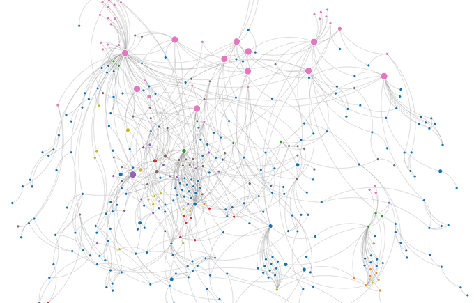
You can see the Olympians sitting pretty at the top in pink. The sky, sea, river and earth dwellers are mixed up though (you can see the big purple node which is Poseidon, who lives in the sea). The orange nodes are people from Hades in the underworld, but again there are too many blue nodes (earth dwellers) intermingled around them.
The next option for the y-axis was age. Not the person’s age, but the age they lived in as delineated by Hesiod in his Works and Days poem. These five ages of man range from the emergence of the Cosmos and the primordial gods in the Golden Age, to the Silver Age when Zeus takes the throne from the Titans, the Bronze Age which was characterised by war and violence, the Heroic Age, through to the final Iron Age.
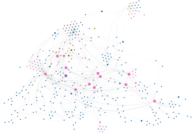
This was looking better. This layout puts the main characters, the Olympians, firmly in the centre and the y positions held out much better than they did for the positioning by home attempt. There were a few cases of intermixing, but this could be because my categorisation of them was incorrect (an exact definition of an age a person lived in is hard to come by so some guessing was involved).
The graph pulling to the left was down to Zeus. He’s the left-most large pink node and by virtue of him having the most connections as King of the gods, I decided to rearrange the Olympians putting him firmly in the centre to spread out the graph more.
Fine Tuning
The only issue with this layout was that I wanted the Olympians to be more evenly spaced across the x axis (some are almost touching). The force simulation algorithm calculates the actual x and y positions based on certain attributes like gravity and repulsion, so you can’t have total control over the final positions.
I decided to modify the move events to fix a node’s position after it had been moved (see code snippet below). This way I could fine tune the layout manually, treating the force simulation layout as a kind of sandbox environment. Use of the collision attribute meant that other nodes would update their positions accordingly without any chance of overlaps occurring.
function dragended(d) {
    if (!d3.event.active) {
        simulation.alphaTarget(0);
    }
    // don't reset the position when drag ends
    d.fx = d3.event.x;
    d.fy = d3.event.y;
}
When I was happy with the fine-tuned layout, I could simply export the nodes and links as JSON files (see below) which would contain the final x and y positions which I could then read in to the final visualisation.
simulation.on("end", function() {
    // export nodes and links with x,y positions
    var a = document.createElement("a");
    var nodesFile = new Blob([JSON.stringify(simulation.nodes())], {type: 'application/json'});
    a.href = URL.createObjectURL(nodesFile);
    a.download = 'node-positions-by-age.json';
    a.click();

    var a2 = document.createElement("a");
    var linksFile = new Blob([JSON.stringify(simulation.force("link").links())], {type: 'application/json'});
    a2.href = URL.createObjectURL(linksFile);
    a2.download = 'node-links-by-age.json';
    a2.click();
});
Final Visualisation
With the x and y positions I could simply read in the JSON data and plot them without the need for the force simulation algorithm. This means that I don’t get the benefit of people being able to move the nodes around, but I felt that the structure of the layout was more important, and adding interactive features like degrees of separation and shortest path (just like Royal Constellations) would be more beneficial.
All that was left to do was the styling. I don’t know about you, but when I think of Greece I immediately think of the Acropolis, set against a perfect azure sky with green hills sloping down the rocks. This became the inspiration for the layout and colour scheme. I loved the blur effect on Nadieh’s Royal Constellations visual so I kept that the same. Many gods and deities are immortalised as constellations which made this seem quite appropriate.
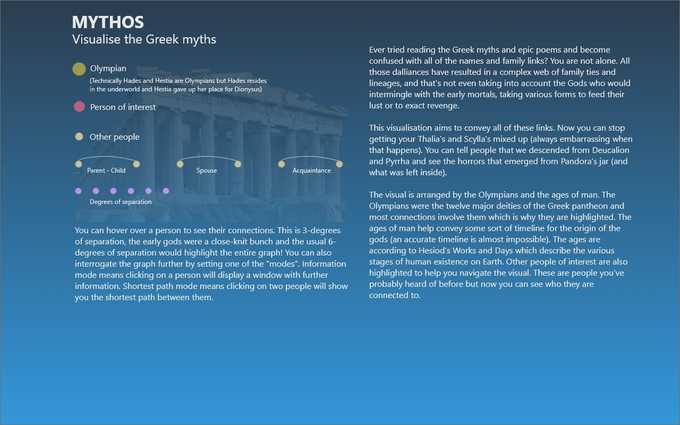
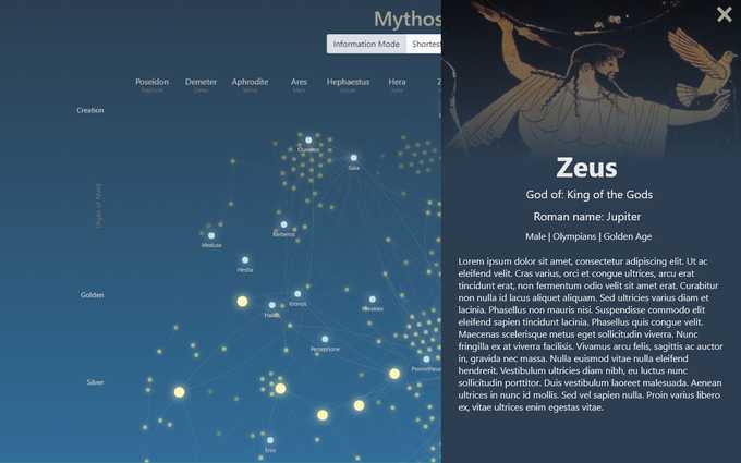
Along with the connections and attributes, my curated dataset also included a brief biography of each character. I decided to provide a dialog window which would show further details when a node is clicked. This conflicted with the shortest path, which needed two nodes to be clicked, so I’ve added a toggle switch where you can switch between these two modes to interact with the visual.
Dijkstra
I wanted to fully understand how the shortest path algorithm works so I rolled my own implementation. The algorithm is known as Dijkstra’s algorithm and is a famous algorithm in Computer Science. This algorithm traverses the entire graph starting from a specified node and will determine the shortest path from this node to every other node in the graph. This is a nice feature as it means we can save the results and just do a lookup the next time we want to calculate the shortest distance instead of having to run it again.
The rules of the algorithm are quite straight-forward. To begin, initialise a distance table data structure such as a list or an array with an element for each node which contains the node identifier, shortest distance (set to infinity or a very large number), the closest node id, and a flag to specify if the node has been visited (initialised to false):
nodes.map(function(node) {
    distanceTable.push({
        nodeId: node.id,
        shortestDistanceFromFirstNode: Infinity,
        previousNodeId: null,
        visited: false
    });
});
Then set the starting node’s shortest distance to zero and the graph can then be traversed:
- Get the next closest unvisited node. The starting node will be the first node we visit because we set the distance to zero.
- Get all the connected nodes to this node.
- For each connected node, if it hasn’t been visited, calculate the distance. For weighted graphs this is the value of the weight (e.g. road length). For Mythos I added weights to the type of relationship i.e. parents are closest, then spouse, then acquaintances. a) Add this distance to the node’s shortest distance value retrieved from our distance table. b) If the total distance is less than the current shortest distance then update the distance table with the new distance and closest node id values.
- Mark the node as visited.
- Repeat until all nodes have been visited.
The algorithm is a “breadth-first” search algorithm i.e. it doesn’t work towards a direct destination (unlike depth-first searching). It expands out from the initial starting point considering all neighbours, choosing the closest until all nodes have been visited. We can then calculate the shortest distance between two nodes by simply reading from the distance table:
- Create a stack.
- Push the destination node id onto the stack.
- Retrieve the node from the distance table.
- Push its closest node id onto the stack.
- Repeat until the closest node id equals the starting node id.
- Pop from the stack and you have the shortest path between the two nodes.
My implementation currently calculates the shortest path for all nodes which results in a slight delay when the page is loaded. This could be optimised by pre-calculating it and making it available as a dataset, or just calculating it on the fly when two nodes have been selected, but this would slow down the user experience.
🆙 Heroes & Homer
The visual has now been updated with characters from Stephen’s equally excellent follow up to Mythos, Heroes. Reading these wonderful books has inspired me to read the classics. I’ve just finished The Iliad and The Odyssey and I highly recommend you do the same. Such great stories and beautiful writing from nearly 3000 years ago, what’s not to like? The background from reading Mythos and Heroes certainly helped when getting an idea of the gods and their capricious ways. The main characters have also been added to the visualisation.