This project came about as part of a Data Science course I was undertaking. The module in question was ‘Understanding Data’ which was an introductory module aimed to convey a high level of understanding of the data analytics process. The final assessment was to use the techniques described in the module to solve a business problem of my own choosing.
The problem
The world of online news is getting a lot of attention. Recent political unrest has been blamed on the rise of fake news and social media companies not taking more care about the stories which are disseminated on their platforms. This has led to a situation where the very nature of news reporting has come under attack. I wondered if it was possible to create a news site that only reported on good news to try and restore the balance? This begs the question, “Can news be separated into good news and bad news?” With many people feeling tired of the barrage of negativity put forth by the mainstream media, coupled with a rising distrust, this could help restore people’s faith in news reporting by informing them that it is not good news that is in short supply, it is good news reporting.
Therefore, the objective of the analysis was to investigate whether news can be categorised into good and bad to decide whether a good news site is viable. The first question was to define what is meant by good news and bad news:
- Good News: A news story without the negativity that seems to pervade the news today. This could be any positive news story such as an act of human kindness, a scientific breakthrough, a good policy decision or just something light hearted.
- Bad News: This category is basically any other news story. One of the assumptions made about this analysis is that the overwhelming majority of news today is negative, the old adage “if it bleeds, it leads” seemingly the modus operandi of all major news outlets.
The process
The process of answering this question needs to be undertaken under the umbrella of a data analysis framework. This is necessary to define the steps that are required to be followed to reach an insight into the problem. Workflows have been built upon many years of data analysis work by experts in the field and to make use of that knowledge will help reach a more informed decision. By taking a standardised approach the danger of falling into a “rabbit hole” is lessened somewhat. This is the common occurrence of the analysis not answering the original problem and veering off at tangents. Therefore, the most important aspect is to state the aim of the analysis at the outset. All workflows begin with a business understanding step, which enforces a clear phrasing of the question that is to be answered.
The Data Science process (CS109) was chosen. It is a functional work process with clearly defined goals at each step. The non-linear aspect to this process makes it the ideal candidate. As the initial question becomes better understood as we become more familiar with the data, we can skip back to previous steps and try a different modelling approach to iterate through the process to achieve a better insight.
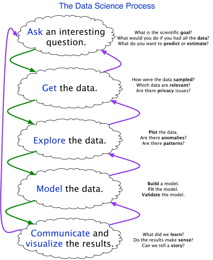
Ask
The question we are interested in is can news be separated into good news and bad news? More specifically:
Can online news be separated into good news, that is a news story with a positive sentiment, and bad news, which is a news story with a negative sentiment?
To answer this question, we must address the following challenges:
- Can we obtain news article content?
- Can we scan the article to get a sentiment score?
- Can we identify good news and bad news from the sentiment score alone? Or is a more qualitative approach required?
- If we can identify good news, can a model be built to predict the likelihood of a new story being good or bad?
The answers to these challenges will answer the overall business goal: “Is a good news website feasible or not?”
Good or Bad?
The immediate concern with this question is whether it is too subjective. What exactly makes a good news story? There clearly isn’t a single answer to this question. The fields of psychology and political science have addressed the demand for negative news (Trussler & Soroka, 2014) and what this can do to our mental health (Baden, 2015) without identifying a taxonomy for what constitutes good and bad news. Studies that have tried to address the problem of negative news have come closer to answering this. They reveal that it is not necessarily the subject of the story that makes it good or bad, but the language used within it (Gyldensted, 2011). A high negative word ratio and a “victim narrative” identify strongly as negative news stories, whereas factors such as having a higher positive word ratio (around 3:1) (Fredrickson & Losada, 2005), having a positive message at the peak and end of a story (the peak-end rule) (Kahneman, et al., 1993), and a meaningful narrative can identify a story as a positive one. This enforces our approach of scanning the content of the article for a sentiment score.
Get
The next stage of the process is to gather data that can help answer the question. There didn’t appear to be any readily available data on news article sentiment. Most research in this area has focused on improving sentiment analysis algorithms. The current political climate has diverted attention to the question of fake news analysis rather than sentiment analysis. It became apparent therefore that the dataset would have to be created from scratch.
News Scraping
Most online news companies make available an RSS feed. This is a type of web feed which gets updated every time there is a new story. You can subscribe to the address of the feed to keep track of the news. Most news feeds return the URL of the story, from which the content can be scraped, along with other metadata such as title, summary, published date and the source. A selection of feeds was chosen to represent a broad political spectrum of the news landscape. A specific good news site was also included, the idea behind that being that it will provide some good news examples for a model to be trained with, whereas mainstream media stories might be more negative.
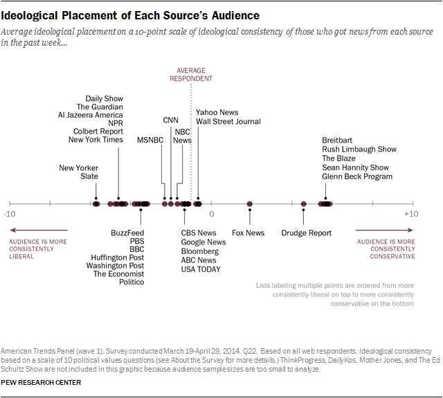
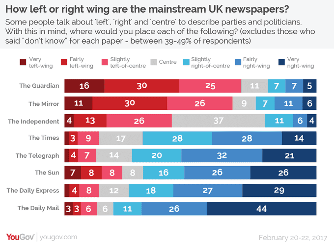
Based on the figures above, to represent the full political spectrum the following sources were selected:
- The Guardian ‐ left wing
- BBC News ‐ centre left
- The Independent ‐ centre
- The Daily Mail ‐ right wing
- The Good News Network ‐ for examples of good news
- Reuters
One of the aims of the analysis from the outset was to see if good news is available, just not reported. Many online news sites get their stories from news agencies like Reuters, which is why it is included. If Reuters sentiment is higher than the other sites then we can potentially answer this question.
Sentiment analysis
From the content a sentiment analysis score will need to be obtained. Most major cloud computing companies offer a sentiment analysis product as part of their artificial intelligence suites. Natural Language Understanding from IBM Watson was chosen as it returned more sentiment observations than any competitor, most just returned a single positive or negative score, but Watson returns additional emotions such as joy, anger, disgust, sadness, and fear. The more variables we can gather the better we can understand the problem and answer the original question. It also handles the text scraping for us, all we have to do is provide the URL.
Data Pipeline
More data isn’t necessarily better. If the data is chosen in a more informative way you can get away with using smaller datasets. We have attempted to make an informed decision by selecting news feeds from across a wide range of political stand-points, but our question isn’t so much concerned with which news company is more positive than another (that could make for interesting secondary analysis) but just with good news itself. Also, the lack of any existing data, and the time required to create manually, meant that some sort of automation was required to gather the data.
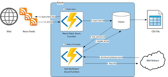
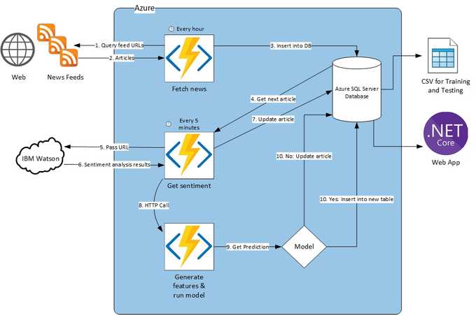
An automated data pipeline was created using the Microsoft Azure cloud. The use of Azure Functions means that scripts can be set to run on a timer. The retrieval of news articles from the RSS feeds and retrieval of sentiment scores can be separated into their own Azure Functions and set to run at a specific time interval. A news fetch function runs once every hour and inserts new stories into a database. A sentiment analysis function then runs every five minutes, gets the next row in the database without a sentiment score, passes this to the Natural Language Understanding API and updates the database with the results. This automated pipeline means we can accumulate a large dataset with little or no extra work apart from the initial setup.
Explore
A combination of Python and Orange is used to explore the dataset. The structure of the dataset can be seen in the table below. It’s a good idea to review the structure at this juncture to make sure we have the data we need to answer our original question and to understand what type of problem we are trying to solve. Many data science workflows ask three questions at this point to help guide the rest of the workflow:
- Supervised or Unsupervised Learning? Supervised learning needs a target variable that is labelled so a model can learn from the existing labels to make new predictions. Techniques such as regression and classification are used here. Unsupervised learning doesn’t have labels to train with. Unsupervised learning algorithms will instead look for patterns and groupings in the data using techniques such as clustering. We want to predict a good news story using sentiment and emotion scores, we don’t have any labels at this point so it is an unsupervised learning problem.
- Classification, Regression or Clustering? We have an unsupervised learning problem so we will have to use clustering for our initial analysis.
- Prediction or Inference? We are predicting whether a news article is good news or bad news based on our sentiment and emotion features. Inference would be looking at how one feature affects an output which we are not doing.
| Column | Description |
|---|---|
| Link | URL of the article |
| Title | The article headline |
| Description | A short description of the article |
| Summary | A longer paragraph summarising the article |
| Date | Date the article was published |
| Image | URL for the article banner image |
| Source | Name of the news feed that published the article |
| Sentiment | Sentiment score between -1 (negative) and 1 (positive) |
| Joy | A score between 0 (the article does not convey that emotion) and 1 (the article definitely conveys that emotion) |
| Anger | A score between 0 (the article does not convey that emotion) and 1 (the article definitely conveys that emotion) |
| Disgust | A score between 0 (the article does not convey that emotion) and 1 (the article definitely conveys that emotion) |
| Sadness | A score between 0 (the article does not convey that emotion) and 1 (the article definitely conveys that emotion) |
| Fear | A score between 0 (the article does not convey that emotion) and 1 (the article definitely conveys that emotion) |
Data Cleaning
Even though the dataset has been created from scratch to meet our demands, real world data is messy, and there still needs to be some cleaning performed. Data types were checked and modified accordingly, the sources were categorised by company (e.g. ‘World news | The Guardian’ and ‘UK news | The Guardian’ both became ‘The Guardian’).
Missing Data
Missing data can affect the fit of a model or lead to a biased model because the behaviour and relationships with other variables haven’t been fully analysed. This leads to incorrect predictions so it’s important to check for missing data and deal with it accordingly. It’s possible that our sentiment analysis function hasn’t been run on every article at the time of export. Each row without a sentiment score was therefore removed.
Exploration
Listing a general statistical summary of the dataset is a good way to start the exploration:
| Sentiment | Joy | Anger | Disgust | Sadness | Fear | |
|---|---|---|---|---|---|---|
| Count | 19661 | 19661 | 19661 | 19661 | 19661 | 19661 |
| Mean | -0.20 | 0.41 | 0.21 | 0.26 | 0.47 | 0.21 |
| Std | 0.36 | 0.21 | 0.15 | 0.19 | 0.16 | 0.17 |
| Min | -0.93 | 0.001 | 0.01 | 0.0001 | 0.00005 | 0 |
| 25% | -0.48 | 0.16 | 0.12 | 0.11 | 0.44 | 0.10 |
| 50% | -0.26 | 0.50 | 0.15 | 0.17 | 0.53 | 0.13 |
| 75% | 0.03 | 0.57 | 0.21 | 0.47 | 0.57 | 0.20 |
| Max | 1 | 1 | 0.76 | 1 | 0.92 | 0.78 |
The max and min values show that the sentiment analysis API returned valid results and there are no outliers, i.e. all values are between -1 and 1 for sentiment, and 0 and 1 for emotions.
The mean sentiment validates our initial hypotheses that the majority of mainstream media reporting is negative, although joy seems quite high if this really is true.
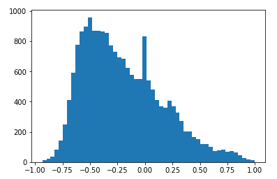
Plotting a sentiment histogram confirms the hypothesis that the majority of news is negative. There is a second peak at zero which, although it is a valid value (indicating a more neutral sentiment), it was checked to make sure this wasn’t as a result of the sentiment analysis returning a null value for whatever reason. The other variables all had valid values when sentiment is equal to zero so this was considered to be OK.
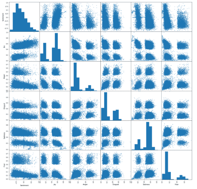
The next stage was to investigate the relationship between variable’s relationships. A scatter plot matrix is a good plot to get an overall idea of this. What is striking about this plot is the groupings. It seems we have very distinct groupings of emotions, which seem to come in four different groups. Sentiment is different, we see two distinct groups. The histograms of the emotion variables (joy, anger, disgust, sadness and fear) show that emotions tend to be at one extreme or the other, with not a lot in between, hence the two distinct groupings. As sentiment becomes more positive, the negative emotions like fear, sadness, disgust and anger reduce, but the opposite happens for joy, which as a positive emotion, makes sense. The emotion histograms however seem to be telling us that our initial hypothesis about news being negative and fear mongering isn’t perhaps quite the case. Fear, disgust and anger are skewed towards zero, and joy is skewed in the other direction. Sadness is the only emotion that seems to back up our hypothesis. The conclusion at this stage seems to be that although the overall sentiment of the majority of news is negative, the journalists weave a narrative, conveying the full gamut of human emotions.
The distinct groupings are also intriguing in another way. We have an unsupervised learning problem and need to use clustering to analyse the data. It would appear we have obvious clustering already in the data. Can we answer our problem already without the use of a model?
Plotting sentiment against joy and selecting the articles at the peak of both is our first port of call:
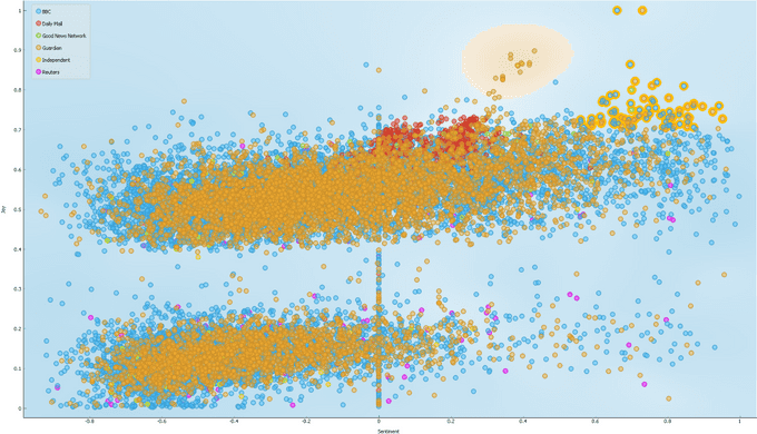
At first glance it would appear that we can simply select all articles above a certain sentiment and joy threshold and class them as good news. However, a few bad news articles were included in the selection, see the table below. For a web site devoted to good news a single bad news story finding its way onto the site would be very embarrassing, so a simple threshold check will not suffice.
| Title | Sentiment | Joy | Anger | Disgust | Sadness | Fear |
|---|---|---|---|---|---|---|
| Gold state coach journey ‘horrible’ says Queen | 0.65 | 0.72 | 0.06 | 0.11 | 0.11 | 0.05 |
| First database of burial grounds in England and Wales to be created | 0.74 | 0.74 | 0.07 | 0.08 | 0.15 | 0.11 |
| Eddie McConnell obituary | 0.76 | 0.70 | 0.08 | 0.09 | 0.46 | 0.05 |
| UK falls to eighth place in Good Country Index, below Ireland | 0.83 | 0.75 | 0.06 | 0.04 | 0.16 | 0.06 |
Clustering
The next stage was to move onto unsupervised learning. If the natural clustering and threshold check doesn’t work, can an unsupervised algorithm come up with a better result? K-means clustering was used as it is a good first clustering algorithm to use in unsupervised learning and is a good way to explore the data further.
Feature Scaling
Depending on the units used to collect the data we could have a situation where we have large variance in one variable, and less in another (e.g. weights in kilos and heights in metres). A model might determine that a 1 kilo change in weight is more important, because of the size of the change from one observation to another, whereas we instinctively know that a height change of 1 metre is more important. Feature scaling is a method we can use to standardise the range of variables. Our dataset is fairly well scaled although sentiment ranges between -1 and 1, whereas the other variables range between 0 and 1. It would be better if this was standardised, especially in clustering analysis as this is based on distance measurements. The recommended standardisation is Z-score standardisation which will rescale our variables so that they have a mean of zero and a standard deviation of 1.
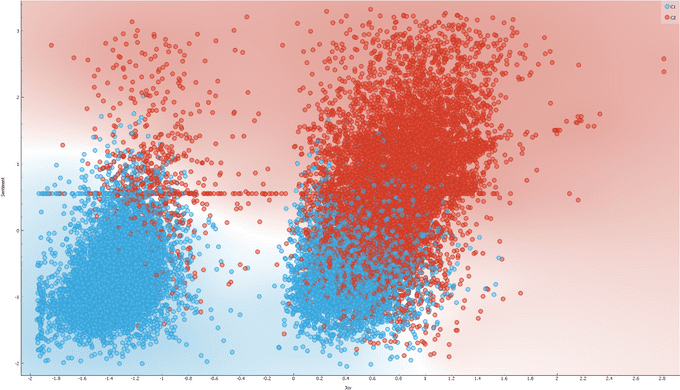
Only a cursory glance is required to realise that this isn’t a satisfactory outcome because we already know that the majority of news articles are bad news. Even increasing the number of clusters doesn’t result in a satisfactory grouping:
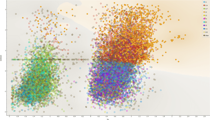
Dimensionality Reduction
Could the dataset be simplified to find more defined clusters? We have six variables in our dataset which could potentially be simplified by deriving a smaller set of variables that still explain the total variance in the dataset, but remove noise and correlated variables that are redundant. Principal Component Analysis (PCA) is one technique that can be used to do this. The image below shows the initial principal component analysis using two principal components. There doesn’t appear to be a clear boundary between clusters emerging.
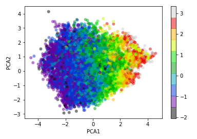
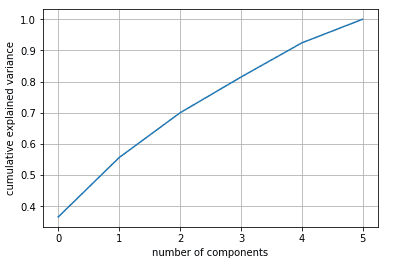
PCA extracts as many components as there are variables in the original dataset, so using more principal components may help. A scree plot (see below) visualises how many principal components explain the variance of a dataset. In higher multivariate datasets we normally see the cumulative effect tail off as we use more principal components but here we see that isn’t the case. This suggests that our dataset doesn’t contain noise, and we don’t have any redundant variables.
It became clear at this point that unsupervised learning wasn’t going to give us an answer and we would have to move onto the modelling stage of the process.
Model
Unsupervised learning, where we’ve looked to algorithms to identify clustering of good news for us, hasn’t resulted in a satisfactory outcome. Therefore, it is necessary to build a model ourselves. To be able to train and test a model we need to add a label to the dataset which indicates whether an article is good news or bad news. This brings us into supervised learning territory. An extra variable was added to the dataset called ‘Good_News’ that is set to either yes or no. This is our ‘target’ variable that we want to use a model to predict.
Before a model was created, I wondered if that now we have a labelled dataset, would any clusters emerge from our PCA analysis carried out previously? Note the analysis is exactly the same, PCA is an unsupervised process, so it doesn’t use any labels, this was just for a visualisation aid:
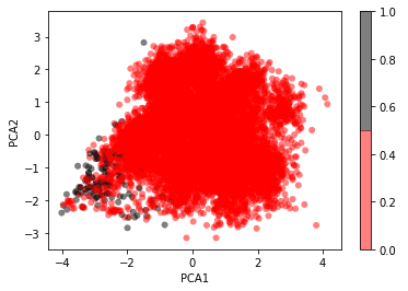
The grey dots represent articles labelled as good news. We can see the beginnings of a clustering but there are too many bad news articles interspersed to be able to define a strict decision boundary.
Logistic Regression
One of the major aspects of modelling is choosing an algorithm. This becomes the baseline model which can then be tweaked (most algorithms will have parameters that can be tuned to affect the result) or even changed completely. The results of new models can then be compared to the baseline to see if an improvement has been made. Referring back to the exploration stage we described the type of problem we were trying to solve was an unsupervised clustering problem. However, now that we have a labelled dataset we can reclassify this as a supervised learning problem. Supervised learning problems can be broken down into regression problems, which deal with continuous variables, and classification problems, which are concerned with discrete variables. Our problem is therefore a classification problem, specifically a binary classification problem because we want to predict one of two possible outcomes, good news or bad news. A good first model for classification problems is logistic regression which will be looked at next.
Fit the model
Before a model can be run the dataset needs to be split into training and test sets. This allows the model to learn from labelled data and its predictions compared to a test set that it hasn’t seen. This helps prevent overfitting to the model which is when the model ‘follows’ the data and doesn’t generalise well to new data that it hasn't seen before.
Validate the model
Once the logistic regression model was built from the training data, we use it to make predictions on the test data and compare the labels to see how accurate it is. A confusion matrix (see below) is then produced to help us visualise the performance of a classification model like logistic regression.
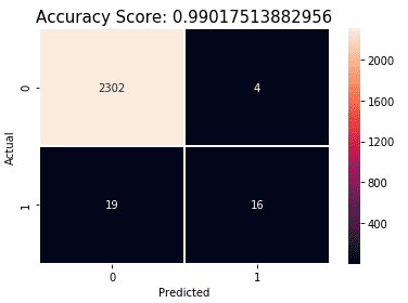
The matrix can be read as follows:
| Predicted No | Predicted Yes | |
|---|---|---|
| Actual No | True Negatives (TN) Predicted No and it is No | False Positives (FP) Predicted Yes but it is No |
| Actual Yes | False Negatives (FN) Predicted No but it is Yes | True Positives (TP) Predicted Yes and it is Yes |
We can glean quite a lot of information from a confusion matrix:
- Accuracy: (TP + TN) / Total = (16 + 2302) / 2341 = 0.99
- Error Rate (how often is the model wrong?): (FP + FN) / Total = 4 + 19 / 2341 = 0.01
- Specificity (when it is no, how often does it predict no?): TN / Actual No = 2302 / 2306 = 0.998
- False Positive Rate (when it is no, how often does it predict yes?): FP / Actual No = 4 / 2306 = 0.002
- True Positive Rate (when it is yes, how often does it predict yes?): TP / Actual Yes = 16 / 35 = 0.45
- Precision (when it predicts yes, how often is it correct?): TP / Predicted Yes = 16 / 20 = 0.8
Our model has an accuracy of 99%. At first glance this seems an excellent result, particularly for a baseline, but let’s dig into the results further. Our bad news predictions are good. Specificity is good, so we are predicting bad news well, and the false positive rate is also good, so we are not predicting good news when it is actually bad. However, our good news prediction is not as great. The model is only predicting 45% of good news at an accuracy of 80%. There is clear room for improvement on this.
Cross-validation
With a scarcity of good news articles in the labelled dataset (around 1% of the total), maybe cross-validation can improve the accuracy of the model. This is a technique where the training set is split into k smaller sets, and for each of the k ‘folds’ a model is trained using k – 1 of the folds as training data, and the resulting model is validated on the remaining part of the data held back. The final model performance measure is then the average of the values of each ‘folds’. The advantage being the entire dataset is used to train and test and each observation is used for testing exactly once. This could give the logistic regression model more visibility of good news articles and help improve the predictions.
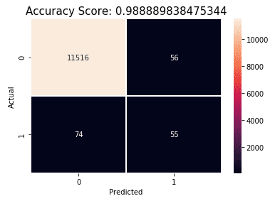
Results:
- Accuracy: (TP + TN) / Total = (55 + 11516) / 11701 = 0.99
- Error Rate: (FP + FN) / Total = 56 + 74 / 11701 = 0.01
- Specificity: TN / Actual No = 11516 / 11572 = 0.995
- False Positive Rate: FP / Actual No = 56 / 11572 = 0.005
- True Positive Rate: TP / Actual Yes = 55 / 129 = 0.43
- Precision: TP / Predicted Yes = 55 / 111 = 0.5
Our true positive rate is slightly worse and the precision has dropped 30%! With more data being used to train the model and worse results it’s clear that the model isn’t good enough, it’s time to look for a different technique.
Decision Tree
A decision tree creates a set of if-then-else decision rules inferred from the data features. The output being a tree which can be traversed to end up with a classification decision at the leaf nodes. The reason behind choosing this model is that we have six features with scores of which a certain combination is hoped can lead to a good news classification. Another reason is that it is an approachable model, the tree can be visualised to see what decisions have been inferred.
A good first run is to limit the depth of the tree. This will give us a feel as to how the decisions are being inferred. We can see that sentiment is the main driver of the tree as it used as the parent node. Joy and anger are the other emotions considered:

Following the tree down the right-hand edge to get to the good news class gives us 219 articles of which a sample is shown in the table below. Most of the articles were good news which was encouraging, a couple of bad news articles did find their way in however, see highlighted. Maybe a deeper tree will consider the sadness emotion, which was higher for this article than the others.
| Title | Sentiment | Joy | Anger | Disgust | Sadness | Fear |
|---|---|---|---|---|---|---|
| Unesco says mobile phones could wipe out the whistled language used by villagers in northern Turkey. | 2.50 | 1.32 | -0.76 | -0.88 | -1.69 | 1.75 |
| Vietnam's tech economy is experiencing an innovation renaissance, with the return of overseas nationals injecting fresh ideas and a new energy. | 2.54 | 1.28 | -0.65 | -0.84 | -2.04 | -0.72 |
| Neil Seviour managed to save his father's life after performing CPR he'd seen demonstrated on TV. | 2.69 | 1.12 | -1.10 | -1.12 | -1.97 | -0.60 |
| How free courses are helping people cook cheap but nutritious meals. | 2.98 | 1.41 | -1.02 | -0.80 | -2.25 | -0.69 |
| Why Smiling Is Good for You and Five Guaranteed Grins on World Happiness Day | 2.50 | 1.62 | -1.07 | -1.28 | -0.17 | -0.85 |
| Job losses expected as publisher Condé Nast announces UK version of title will move from monthly to twice a year | 2.43 | 1.25 | -0.94 | -1.18 | 0.36 | -0.91 |
| Grenfell fire fundraiser shortlisted for $1m global teacher prize | 2.76 | 1.38 | -0.51 | -0.83 | -1.99 | -0.92 |
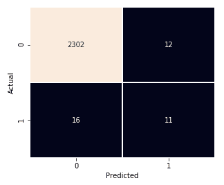
Following the other paths to good news classes in the tree produced a more mixed good/bad news set of results. Rerunning the model at a deeper level to try and incorporate the other emotions into the decisions didn’t result in an improvement:
Overfitting
Decision trees are easy to overfit. To avoid this, it is advised to perform dimensionality reduction beforehand to give the tree a better chance of finding features that are discriminative. The decision tree was rerun using the PCA dataset produced earlier in the workflow, the results can be seen below. No significant improvement is seen so overfitting isn’t an issue.
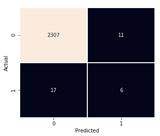
As no improvement can be seen it is concluded that there aren’t enough good news examples to train with. The resulting tree is therefore unbalanced and is biased towards bad news.
Random Forests
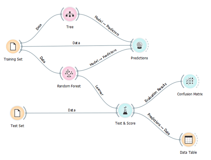
Could we take an ensemble of decision trees and get a better result? Random forest is the model to do this. This model builds a set of decision trees using an arbitrary set of features from the data, hence the term “random”, from which the best feature for the split is selected. The final model is based on the majority vote from individually developed trees in the forest.
This model was created using Orange:
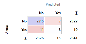
After building and tuning three models without a discernible improvement in accuracy, it seems a good time to stop and present some conclusions.
Conclusions
To return to our original question, “Can online news be separated into good news, that is a news story with a positive sentiment, and bad news, which is a news story with a negative sentiment?”, we conclude that yes, it is possible, but with a major caveat.
Our models have been accurate in predicting bad news but haven’t performed well for good news articles. This shows that while a model can be built to classify articles, most good news stories will be incorrectly classified as bad news, leaving only a very small sample of good news to filter through. This is the major caveat as this means only a small supply of good news articles for the site will be available, and they will tend to be lighter in terms of content i.e. they tend to be on the trivial side of the news, as opposed to more informative news stories (see the table below for examples). In effect our models are playing “safe”, predicting only a tiny subset of possible good news stories. The advantage of this is that false positives are unlikely to appear on the site, which saves an embarrassing bad news article being shown.
| Title | Description |
|---|---|
| Czechs consider national anthem update | Olympic Committee launches new arrangements to mark state's 100th anniversary. |
| Black Panther film: ‘Game-changing’ movie takes $1bn | Analysts say the superhero film, which has a predominantly black cast, is a watershed moment. |
| Prince Harry and Meghan Markle release official engagement photos | Images were taken by the fashion and celebrity photographer Alexi Lubomirski, who says it was an incredible honour. |
| ‘Lost words’ as children stay indoors | Children now spend less time outdoors and their knowledge of nature is suffering, says author Robert Macfarlane. |
| Oscars 2018: Gary Oldman on Best Actor win for Darkest Hour | The British actor thanked his mum after his Oscar win for playing Winston Churchill in Darkest Hour. |
| Egyptians gear up for Ramadan with Mo Salah lanterns | Egyptians gear up for Ramadan with Mo Salah lanterns. |
| Simon Cowell's Syco to produce its first show for the BBC | Dance talent show The Greatest Dancer is also expected to feature Cheryl and Alesha Dixon. |
| Winter Olympics: ‘Taking a moment of history in their stride’ - North Korean duo shine in figure skating pairs | North Korea's only two athletes to have qualified for this year's games on merit have progressed through to Thursday's long pairs figure skating program. |
| Shopping centre Christmas trees made into rhino beds | Rhinos are sleeping on pine scented beds at Woburn Safari Park. |
| Royal engagement gets EastEnders mention | News of Prince Harry and Meghan Markle reached Albert Square. |
| More 1,000 take part in Boxing Day swims | There were beach events in Tenby and Pembrey, and a swim at the lido in Pontypridd. |
| ‘If You Were Me’ TV show youngsters reunited after 48 years | The early 1970s BBC television programme “If You Were Me” took children on cultural exchanges around the world. |
Aside from considering whether these are actually good news articles, they are not exactly hard-hitting, informative stories. The question therefore becomes, would anyone want to read news stories like this?
The major factor in this result is that the problem domain is too subjective. Our exploration and subsequent models never produced a satisfactory decision boundary that helped to identify a good news story. This reflects the idiosyncratic nature of what constitutes a good news story which confirms our fears described in the Ask phase of the process.
Going Forward
One of the biggest obstacles was a lack of balance in the training data. Modern news, as it is today, being too unbalanced in terms of good and bad news, which in turn caused our models to be biased. Given more time, more good news articles could have been collected and labelled to try and redress the balance which could have improved the accuracy.
The black box approach to the sentiment and emotion scores could also have been an issue. We had no control or inkling into how Watson produced the scores. Was noise removed? i.e. advertisements, comments, links to other articles, author biographies etc. This could have affected the scores and prevented us from building an accurate model.
A lot of articles in the dataset were videos. These were articles with very little text, just an accompanying video. With limited text available to get a sentiment score, the accuracy of the scores are called into question. With no way of retrieving the subtitles or captioning from the video it would have been better to have removed these from the dataset, but without an easy way to identify them, this was considered too time consuming. Other types of articles such as photo stories, satirical cartoons, and quizzes also magnified this issue.
Splitting articles into categories may have helped. A positive technology story is probably different in sentiment and emotion to a positive politics story for example. Unfortunately, news feeds didn’t make a category available. If it was, models could have been catered to each category to try and improve the accuracy.
There was also an ethical issue at the heart of this analysis and it concerned the labelling of the supervised dataset. A model is only as good as the training data, and any biases inherent in it will emerge. I was the only person who labelled the dataset, and by extension, decided on what constituted good and bad news. A better approach would have been to get multiple people from different backgrounds and political standpoints to label the data and reach some sort of consensus.
Good News 2.0
To try and rectify this issue I’m currently collecting more data and doing some feature engineering to try and create a better training set to produce a better model. Another Python script that parses the actual content of the articles has been created. This is deployed as another Azure Function that gets called when a new article is inserted into the database. It generates features such as word count, average word length, character count etc. to see if these can be used as predictors. The feature engineering involves separating quotes from the articles. The idea being that quotes from people involved in the story are better predictors of sentiment, as opposed to the journalistic language in-between which is more neutral by comparison. NLP techniques are also used in the script to “lemmatize” the article text. This is where variants of the same word are grouped together (e.g. plurals) to distil the text into its constituent words. From this we can analyse if it contains more positive than negative words more easily which was one of the techniques established in the Good or Bad section.
Alongside this work more articles are being labelled, particularly good news articles to try and balance the datasets and prevent biased results. This is currently ongoing so stay tuned for the results!
🆙 Good News v2.0
A substantial dataset is now available that contains the new features. A random forest model has given the best accuracy and it utilises some of the new features, particularly quote subjectivity and lemmatized subjectivity, which is promising.
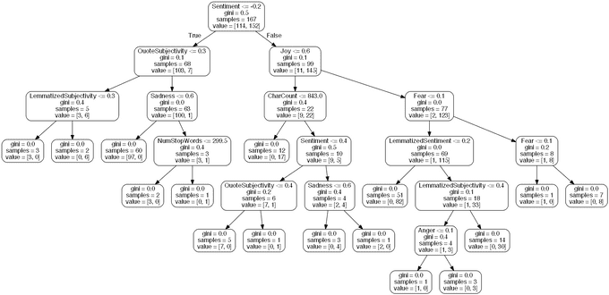
I still have the problem of an unbalanced dataset however (more bad news labels than good). I decided to productionise the model anyway because:
- It will be a good experience to productionise a model to see how it can be done.
- I can use the model’s predictions as a way to generate more good news labels. This saves me having to do it manually and means I can keep improving the model in an iterative fashion.
Productionising wasn’t a trivial task. The model is created using Python and I wanted to run it using Azure Functions. Although Python is supported in Azure, it isn’t a first-class citizen as yet and there are a few pitfalls you need be aware of. The model was pickled and copied over to Azure which didn’t work at first. Pickle doesn’t work across architectures so I had to copy the original Python script over and run it on the server itself.
The feature generation Azure Function could then call the model Azure Function via a HTTP request when it had all of the features available. The model Azure Function loads the pickled model generated earlier to then make a prediction. Each prediction comes with a confidence value which is used as a threshold to only select articles where the confidence is high. These articles are then inserted into a new table for the web site to access.
References
Baden, D., 2015. Shock! Horror! Behind the ethics and evolution of the bad news business. The Conversation, 27 March.
Fredrickson, B. L. & Losada, M. F., 2005. Positive Affect and the Complex Dynamics of Human Flourishing. Am Psychol, 60(7), pp. 678-686.
Gyldensted, C., 2011. Innovating News Journalism through Positive Psychology, s.l.: University of Pennsylvania.
Kahneman, D., Fredrickson, B. L., Schreiber, C. A. & Redelmeier, D. A., 1993. When More Pain Is Preferred to Less: Adding a Better End. Psychological Science, 4(6), pp. 401-405.
Pew Research Center, 2014. Political Polarization & Media Habits, s.l.: Pew Research Center.
Trussler, M. & Soroka, S., 2014. Consumer Demand for Cynical and Negative News Frames. The Internation Journal of Press/Politics, 19(3), pp. 360-379.